In today’s competitive market, a product label is not just a functional piece of packaging; it’s your silent salesperson. Whether you’re selling in a boutique or a supermarket, your label has seconds to catch the attention of a potential buyer and convince them to pick your product. So, how do you design a label that not only attracts attention but also communicates your brand’s essence effectively? Here’s a comprehensive guide to making your product label stand out on shelves.
1. Understand Your Target Audience
The foundation of a standout label is a deep understanding of who your product is for. Is your target audience young professionals, eco-conscious millennials, or luxury shoppers? Each group is drawn to different design elements:
- Minimalist design for luxury-focused buyers.
- Bright colors and bold fonts for younger audiences.
- Earthy tones and eco-friendly materials for the environmentally conscious.
Knowing your audience helps you align every design decision with their preferences and values, increasing the chances of capturing their attention.
2. Use Eye-Catching Colors
Colors are one of the first things consumers notice on a label. To make your product pop, choose a color palette that:
- Aligns with your brand: Use colors that reflect your brand identity. For instance, green is great for organic products, while red suggests energy and passion.
- Contrasts with competitors: If the shelf is full of blue-toned labels, a bright orange or yellow will instantly stand out.
- Grabs attention but isn’t overwhelming: Combine bold accent colors with neutral tones for balance.
3. Prioritize Legibility
If a consumer can’t quickly read what your product is, they’ll likely move on to the next. To ensure readability:
- Choose clear fonts: Avoid overly decorative or hard-to-read fonts. Sans-serif fonts like Helvetica or modern serif fonts like Times New Roman work well.
- Optimize font size: The product name should be large enough to stand out, followed by essential information in smaller but legible text.
- High contrast: Ensure the text color contrasts well with the background. For example, black text on a white background or vice versa is easy on the eyes.
4. Focus on Visual Hierarchy
A great label guides the viewer’s eye to the most important information first. Establish a clear visual hierarchy by:
- Highlighting the product name: Make it the focal point.
- Using bold or unique typography for key details: For example, “Organic,” “Gluten-Free,” or “Award-Winning.”
- Structuring information logically: Place the brand logo at the top, the product name in the middle, and additional details like weight or benefits at the bottom.
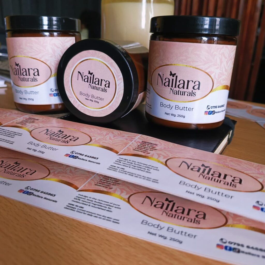
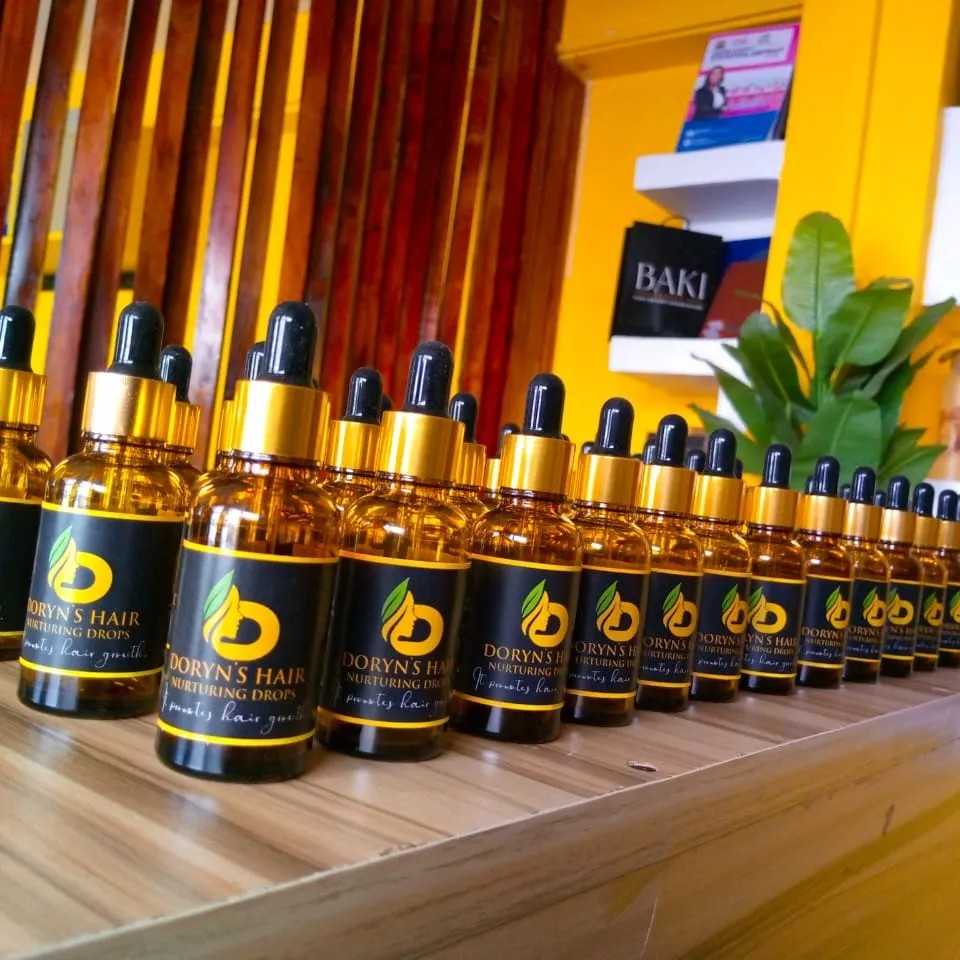
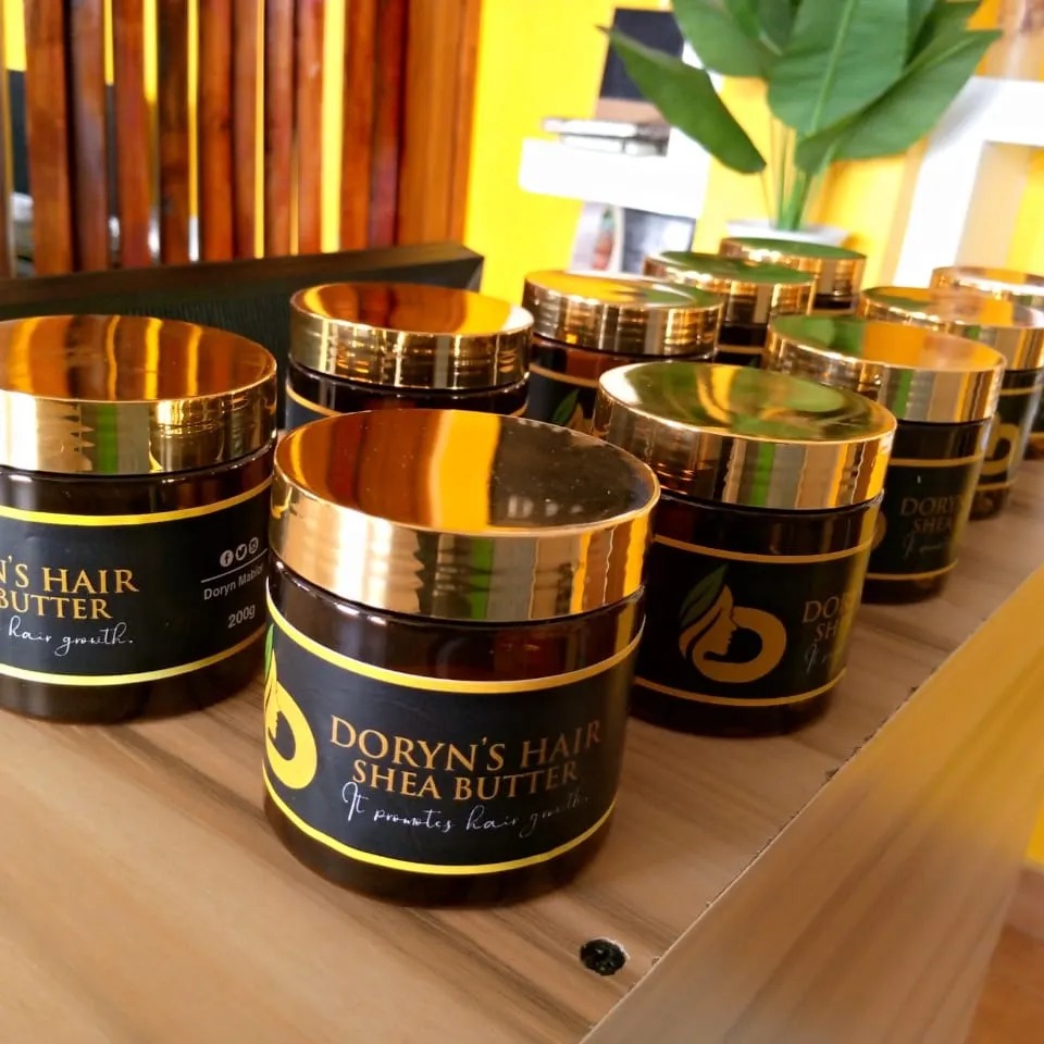
5. Incorporate High-Quality Imagery
Adding an image or illustration can make your label more visually engaging. Options include:
- Product-related imagery: Use photos or illustrations of the ingredients or finished product.
- Abstract visuals: Patterns or textures can add depth and intrigue without cluttering the label.
- Iconography: Small icons indicating certifications like “Vegan,” “Non-GMO,” or “Recyclable” can enhance the label’s appeal.
Ensure all imagery is high-resolution to maintain a professional appearance.
6. Emphasize Brand Identity
Your label is an opportunity to reinforce your brand. Make sure it includes:
- Your logo: Place it prominently but without overwhelming the design.
- Brand colors and typography: Consistent use of these elements builds recognition across your product range.
- A tagline or brand message: A short, catchy phrase that tells your story or mission can leave a lasting impression.
7. Highlight Unique Selling Points (USPs)
Consumers want to know what sets your product apart. Use your label to showcase:
- Ingredients (e.g., “Made with 100% Organic Coconut”).
- Benefits (e.g., “Packed with Antioxidants”).
- Certifications (e.g., “Certified Fair Trade”).
Keep these points brief and visually distinct using badges, bold text, or icons.
8. Invest in Premium Materials
The texture and quality of your label can influence how customers perceive your product. Some options include:
- Glossy finishes for a sleek, modern look.
- Matte finishes for an understated, premium feel.
- Textured paper or embossing to add tactile interest.
- Foil stamping for a luxurious touch.
Durability is also essential, especially for products that will encounter moisture or handling.
9. Add Interactive Features
Incorporating interactive elements can enhance engagement and make your label memorable. Consider:
- QR codes: Link to recipes, tutorials, or your brand story.
- Peel-back labels: Perfect for including additional information without crowding the main design.
- Augmented reality (AR): Use apps to bring your label to life with animations or videos.
10. Test Your Design
Before printing, test your label design in real-world conditions. Place it among competitors’ products and ask:
- Does it stand out visually?
- Is the text easy to read from a distance?
- Does it align with your brand identity?
Gather feedback from focus groups or your target audience to make adjustments as needed.
11. Stay on Trend
While timeless design is key, incorporating current trends can make your product feel modern and relevant. Some popular trends include:
- Minimalism: Clean designs with ample white space.
- Bold typography: Oversized, statement fonts.
- Sustainability: Recycled materials and earthy tones.